print
events
digital

You may also like

Making Language Visible
2018
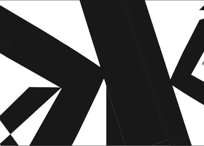
At the outset of this typography exploration course, I was assigned the renowned typeface Frutiger, created by the illustrious Adrian Frutiger. Throughout the semester, I adhered to a series of stringent parameters, including the application of rules and the combination of letterforms. These guidelines were instrumental in challenging me to think creatively and design beyond conventional boundaries.
The Pivot Group 2022 Cycle
2022
Over the past year, I’ve been working as a cycle Graphic Designer for The Pivot Group. Since transitioning from my position as an intern, I boosted my knowledge in political design and interdepartmental communication. Working in a high volume and paced environment has further strengthened my time management skills and improved my design process. I’ve created a plethora of pieces ranging from positive mail pieces to yard signs and candidate merchandise. I’ve studied the importance of in house printing, polling and targeting which directly impacted the work that I produced.
Bath & Body Works
2018
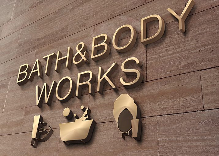
For this project, I was granted the liberty to select a company of my choosing to develop a comprehensive pictogram system. I chose Bath & Body Works due to their continual expansion and efforts to reach a broader audience. This selection provided a unique opportunity to design a diverse array of deliverables, effectively showcasing various facets of their brand. Through this project, I was able to creatively highlight the extensive range and dynamic nature of Bath & Body Works.
The Pivot Group Internship
2021
During the past Fall, I had the esteemed opportunity to serve as a Graphic Design Intern at The Pivot Group. This experience afforded me invaluable insights into the realm of Political Design and the intricacies of interdepartmental collaboration. Throughout the duration of my internship, I had the privilege to refine and evolve my personal "design style," which I successfully applied to a range of projects, including a mail piece and various social media posts. This role significantly enriched my understanding and proficiency in the field, marking a pivotal point in my professional development.
AIAA
2019
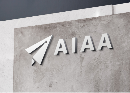
The American Institute for Aeronautics and Astronautics (AIAA) stands as a distinguished professional society dedicated to the field of aerospace engineering. Throughout the duration of this class, I had the opportunity to develop various components of a comprehensive brand system for AIAA. These elements encompassed the creation of icons, the design of 2D applications, and the production of brief animations. This endeavor not only honed my design skills but also deepened my understanding of branding within the aerospace industry.
Type & Image
2019
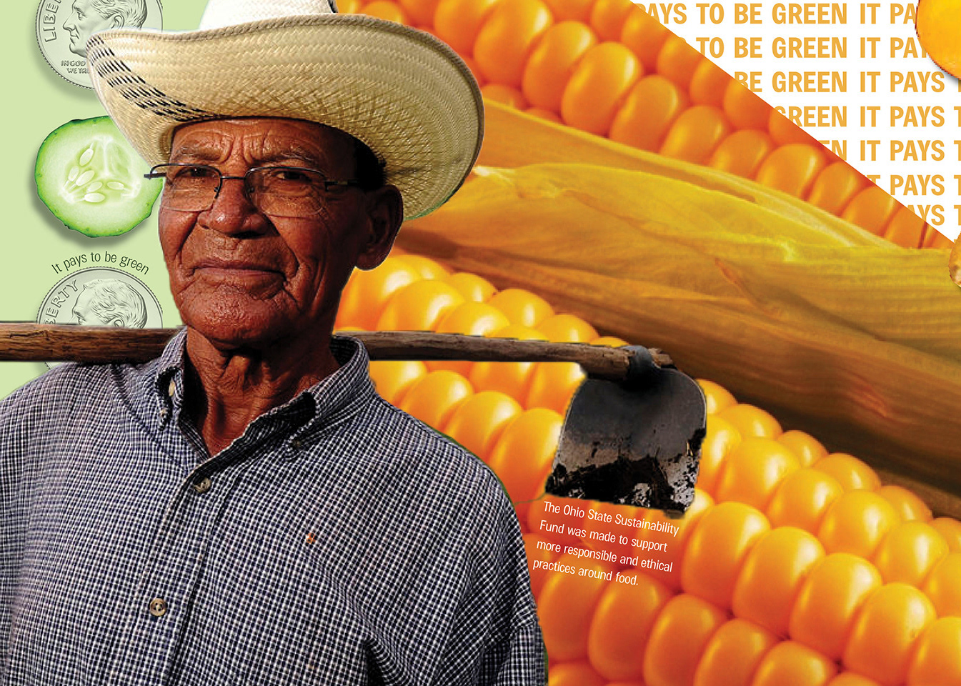
This project was dedicated to the exploration of typography and imagery to craft a compelling narrative. While the overarching theme centered around food, my focus delved deeper into the critical aspects of affordability and nutrition. Through a thoughtful combination of textual and visual elements, the project aimed to highlight the significance of these factors, weaving a story that underscores their impact on society.
Blueprint
2020
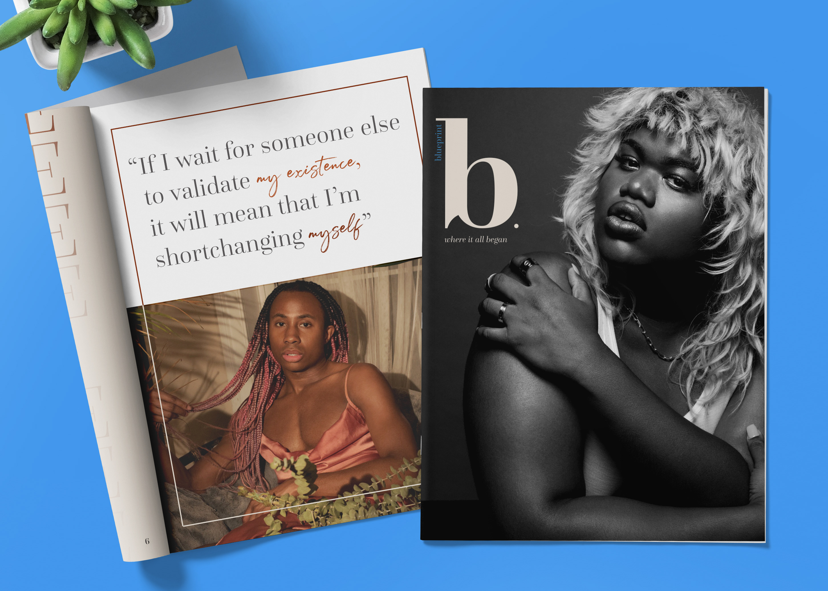
My senior thesis was a heartfelt tribute to Black Trans Women, emphasizing the profound significance of their lives and experiences. Titled "Blueprint," this project envisioned a fictitious brand dedicated to amplifying the voices of the most marginalized through a sophisticated editorial lens. After extensive research, I produced three comprehensive design deliverables. The project features meticulously crafted magazine spreads, a transformative Instagram makeover, and compelling posters that collectively narrate the myriad stories of these women. This work not only highlights the importance of representation but also showcases the power of design in fostering social awareness and change.
Back to Top